Data Visualizations in Power BI: Appropriate Usage of Charts and Graphs
Power BI is a data visualization and reporting platform that is used by businesses and professionals to make data-driven decisions. With over 5 million subscribers, It is one of the most popular data visualization tools on the market. The use of data visualization has changed the way businesses perform in the market, carving out a new path of discovering new insights hidden in massive amounts of data that earlier was not possible. Power bi makes it easy to create stunning visuals of analyzed dataset, making it easy for business owners and shareholders to understand how the business is doing. In this article I’ll teach you the right way to use charts and graphs in power bi.
Setting up your First Report
1. Steps to successfully install power bi
2. Connecting power bi to various data sources:- To connect to a data source, select the data source from the Get data window and select Connect.
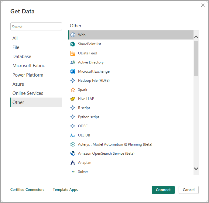
3. After you’ve selected the data source, Power BI Desktop connects to the data source and presents the available data sources in the Navigator dialog box.
4. Select the tables and other data that you want to load. To load the data, select the Load button at the bottom of the Navigator pane. To transform or edit the query in Power Query Editor before loading the data, select the Transform Data button.
5 Types Of Charts and Graphs in Power BI and their Application
1. Area Chart: Basic (Layered) and Stacked
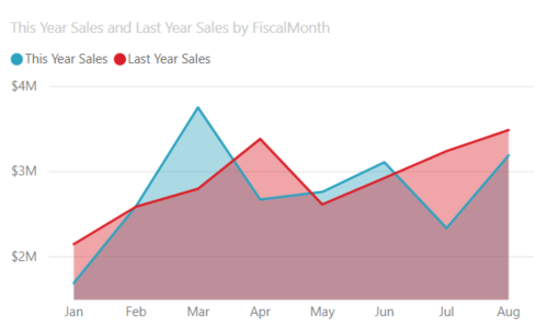
Area charts are used to show trends and patterns in data over time (increase or decrease of two quantitative variable over time). For example, data that represents profit over time can be plotted in an area chart to emphasize the total profit. On the other hand, stacked area charts display the cumulative total of multiple data series stacked on top of each other, showing how each series contributes to the total.
Example: The example below shows the change in total sales through a period of a year.
2.Bar and Column Charts
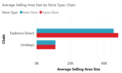
They are mostly used to compare values across different groups/subgroups.
For Example
3.Pie and Donut Chart
Pie charts and donut charts are both used to compare or show different segments of data. They are used to represent data as a part of a whole.
Pie Charts
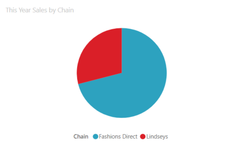
Use pie charts when you want to compare a value (sector) to the total, or when you’re working with a small number of categories (<5). Ideal for revenue calculation, demographics, survey result and so on.
The Example below shows the sales proportion of Lindseys to Fashion direct
Donut Chart
Use donut charts when you want to compare a few categories at a glance, or when you want to take advantage of the space in the middle. For 2-4 categories data, stick with donut chart and 4-5 categories go for pie chart.
4.Scatter Plot
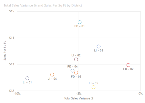
A scatter plot is a data visualization tool used to show the relationship between two variables and also observe the nature of such a relationship. The relationships observed can either be positive or negative, non-linear or linear, and/or, strong or weak.
They are used to plot data points on a horizontal and a vertical axis in the attempt to show how much one variable is affected by another.
For Example: This a a scatter plot representation shows the relationship between the sales per ft and the total Sales made.
5.Funnel Chart
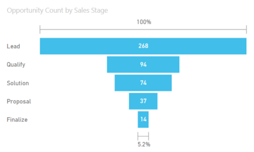
In power bi funnels are used to visualize a process that has stages, and items flow sequentially from one stage to the next.
For Example: A sales process that starts with leads and ends with purchase fulfillment.
Problems To Avoid When Visualizing Data
- -Using too many colors
- -Using color combination that are problematic for color blind individuals(like red and green)
- -Creating clustered visualizations
- -Working with semi-clean dataset
- -Data overloading
Conclusion
Correct usage of charts and graphs in Power BI can help to communicate complex information clearly and compellingly. Power BI offers a wide range of visualization tools, enabling users to tailor their presentations to the specific needs of their audience. Understanding the context of your data, choosing the most appropriate visualization type, and focusing on clarity are essential for making data-driven decisions.


